Welcome to Top Ten Tuesday! Top Ten Tuesday is a weekly meme created by The Broke and the Bookish. Each week bloggers post a top ten list related to a specific theme. This week's theme is Ten Book Cover Trends (or just elements of covers) I Like/Dislike.
Trends I Like
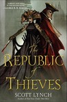
1. Covers with the title and author clearly written
Although I do like fun covers, I absolutely love covers that prominently display the title and author in a clear manner. In fact, sometimes I prefer simple covers that just have the title and author in an easily readable font and nothing else. I hate it when I have to read the title page, because I can't read the cursive font on the cover.
2. Covers that reflect something from the book
Most of the time, the cover illustrators don't know too much about the books that they are designing covers for, so I give the illustrators a pass for covers that are a bit vague on the details. At the same time, I do love book covers that give me a hint of what is to come inside the cover!
Most of the time, the cover illustrators don't know too much about the books that they are designing covers for, so I give the illustrators a pass for covers that are a bit vague on the details. At the same time, I do love book covers that give me a hint of what is to come inside the cover!
3. Gimmicky covers
I love gimmicky covers. I especially love covers that glow. It doesn't make any sense to have a glow-in-the-dark cover, because you don't read in the pitch dark, but I love this gimmick.
I love gimmicky covers. I especially love covers that glow. It doesn't make any sense to have a glow-in-the-dark cover, because you don't read in the pitch dark, but I love this gimmick.
4. Stand-out covers
I love covers that are easily recognizable, so if I am the store or the library, I can find it easily. I am much more likely to spend money on a book, if I can find it in a few seconds.
I love covers that are easily recognizable, so if I am the store or the library, I can find it easily. I am much more likely to spend money on a book, if I can find it in a few seconds.
5. Matching covers
I love it when all the books in a series have matching covers. I especially love it, if the covers join/link up in some sort of way. For example, the zombies on the covers of the trade paperbacks for The Walking Dead all link up, if you put the trades side-by-side.
I love it when all the books in a series have matching covers. I especially love it, if the covers join/link up in some sort of way. For example, the zombies on the covers of the trade paperbacks for The Walking Dead all link up, if you put the trades side-by-side.
Trends I Dislike
6. The "YA-ing" of book covers
A few months ago, the Mistborn trilogy was reprinted with covers with young folks on the covers for the YA market. For some reason, I find this concept really obnoxious (maybe if I liked the new covers better, it wouldn't annoy me so much). I guess YA readers can't tell if a book is for them or not unless there is a young adult on the cover? No wait, that can't be true, because I read YA books and can figure it out.
7. Famous paintings on book covers
Using famous paintings as cover art is a fairly standard practice, especially for classics. This practice annoys me most of the time, and it drives me especially crazy when the painting has nothing to do with the book itself. The book was printed at least 20 years ago, someone must know what the book is about, right?
Using famous paintings as cover art is a fairly standard practice, especially for classics. This practice annoys me most of the time, and it drives me especially crazy when the painting has nothing to do with the book itself. The book was printed at least 20 years ago, someone must know what the book is about, right?
8. Covers with tons of praise for the book or author
I don't mind lots of praise on the back cover, but I hate it on the front cover. I find this practice annoying, because sometimes it is hard to figure out who wrote the book, because there are so many author names on the cover.
I don't mind lots of praise on the back cover, but I hate it on the front cover. I find this practice annoying, because sometimes it is hard to figure out who wrote the book, because there are so many author names on the cover.
9. Covers with weird textures
I prefer glossy covers. Recently, some book covers have had a weird texture to them that I hate to touch. It isn't a big deal with hardcovers (I just remove the dust jacket), but I can't do that with trade paperbacks.
I prefer glossy covers. Recently, some book covers have had a weird texture to them that I hate to touch. It isn't a big deal with hardcovers (I just remove the dust jacket), but I can't do that with trade paperbacks.
10. "Stickers" that are printed onto the covers
I hate those fake stickers that announce that the book was just turned into a television show or just won an award. The sticker is hiding the pretty cover!
I hate those fake stickers that announce that the book was just turned into a television show or just won an award. The sticker is hiding the pretty cover!